building a brand personality
SOTYKTU is a drug that has a unique position in the moderate-to-severe psoriasis (PsO) treatment landscape. It is a once-daily oral in a category that outperforms many topical treatments. It also avoids the need for injections that scare off many psoriasis patients, making it an easy and approachable treatment.
Our team was tasked with creating a suite of branded elements to disseminate to global partners for use.


Whimsy that works
SOTYKTU empowers patients by giving them the confidence they need to show off their true self. The brand matched this sense of liberation and freedom, while still balancing elements of high-science thinking.
process
The brand was developed to be playful yet purposeful, starting with the global campaign and attitude. The campaign went through multiple rounds of market research and testing, before finding that the message of glee and liberation shined through the best in the wink.
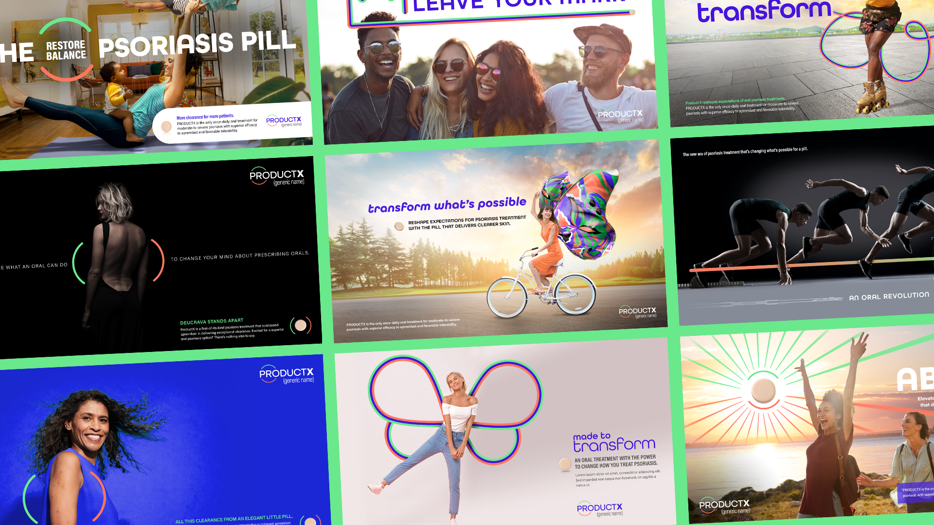
From luxury to leisure, every possible brand identity was explored to make Sotyktu stand out in a crowded space.

Bringing joy to life
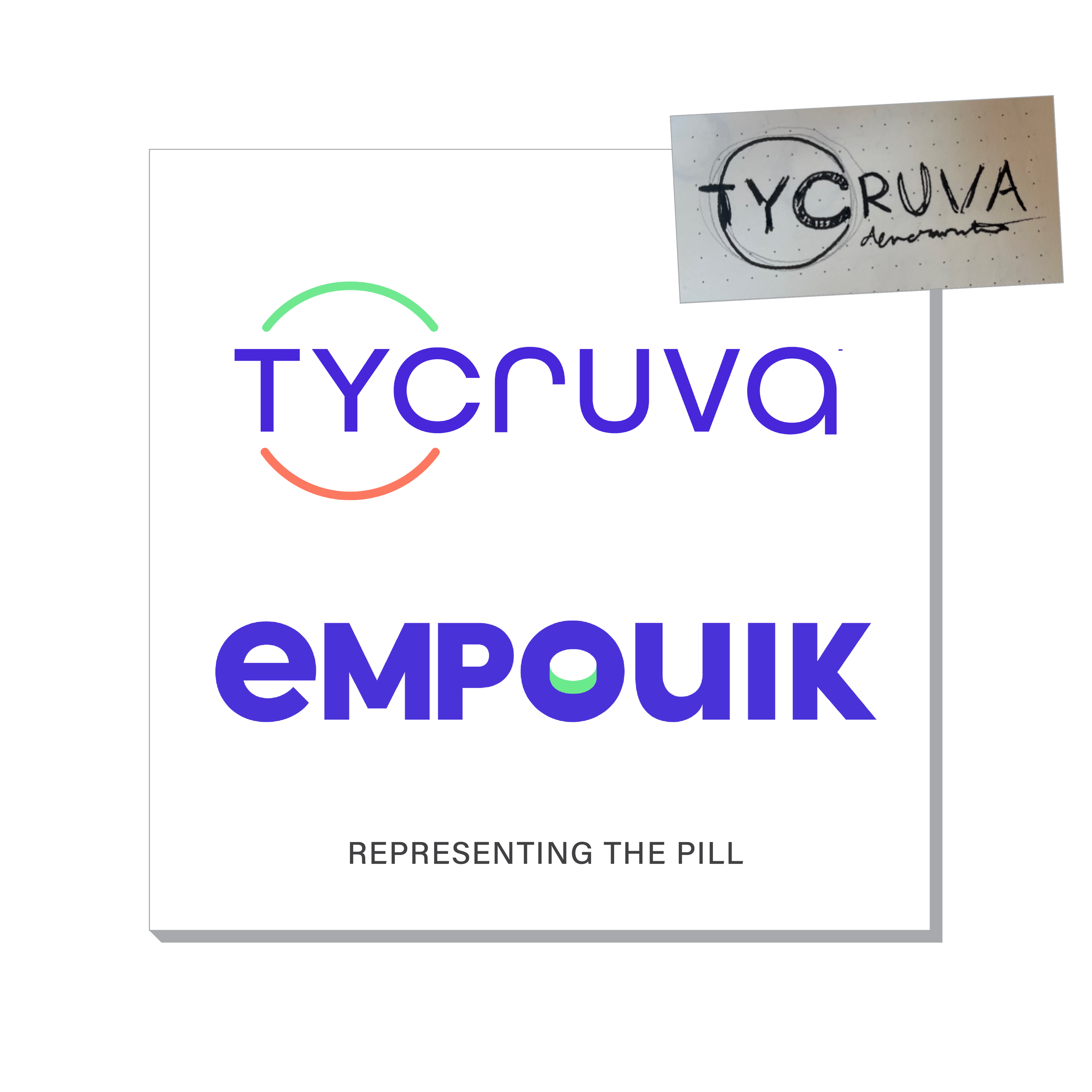
One of the earliest iterations of the wink sought to transition the smile into the logo, strengthening the connection between the feeling of joy and the product.
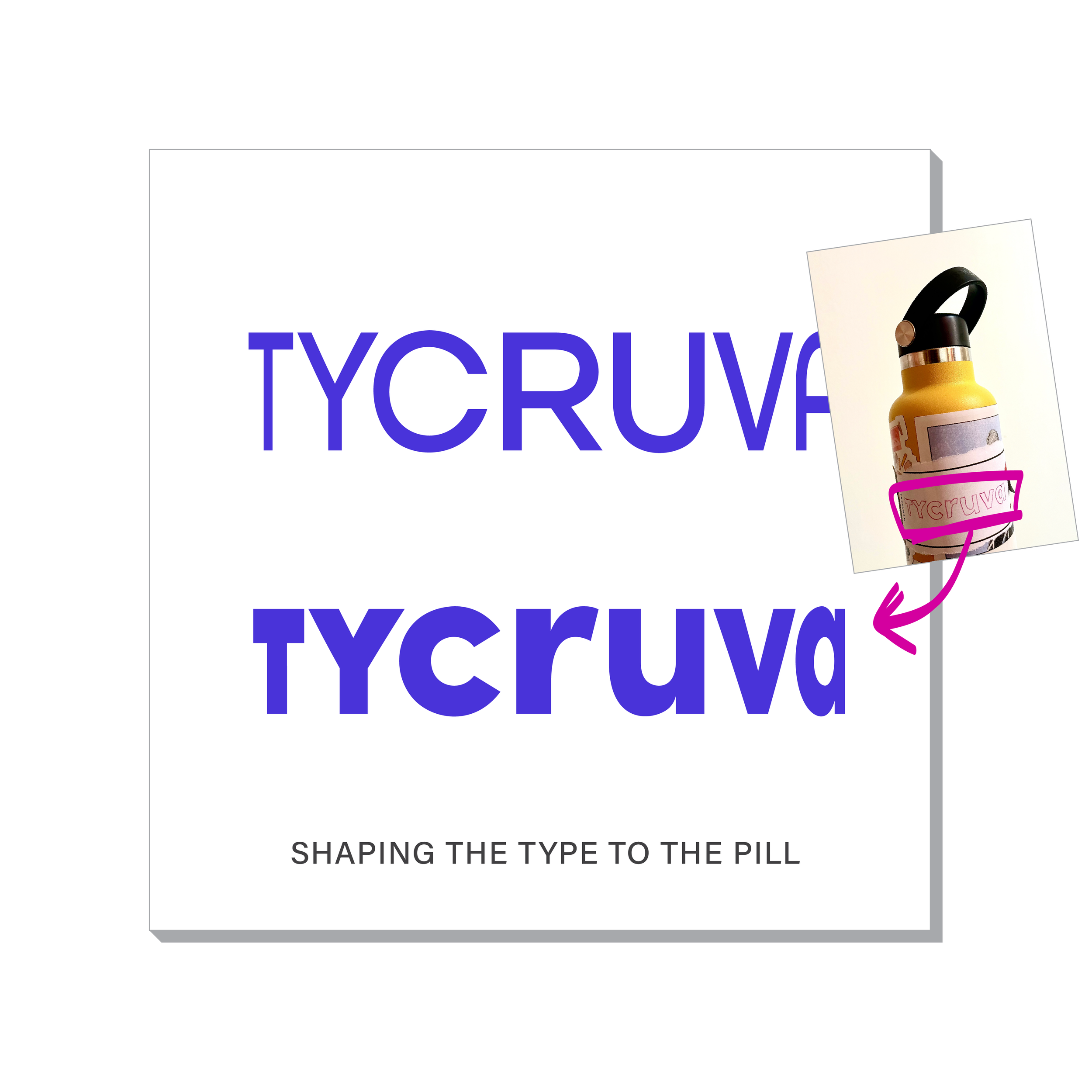
LOGO
We sought to break the traditional, stuffy pharmaceutical mold by injecting levity and liberation into every piece of our brand, including the logo, to make Sotyktu’s identity as unique as its product.